Bolt Design System
Bolt began as a small component library created by a vendor team in 2021. When that team rolled off in 2023 the system was left unsupported by a design team.
At the time I was working on core product and I volunteered to work on the system in my spare time. I had no previous experience in design systems, so read every book & article and listened to every talk I could on how to build one. Eventually I was resourced as the first design system designer and have since been a leading contributor.
Role
Information architecture
Visual design
UI design
Documentation
Tools
Figma
Storybook
Timeline
Jan 2024 - now
Status
Live
The Challenge
Revive an outdated component library, write documentation for its use for designers and developers, incorporate brand design, and more.
Challenges within the former system
The main issues with the old design system were:
• under-resourced…almost completely volunteer-led from the design side
• incomplete documentation for how to apply styles to design work
• outdated visual design
• undefined processes for design escalation and developer handoff
Creating the foundation
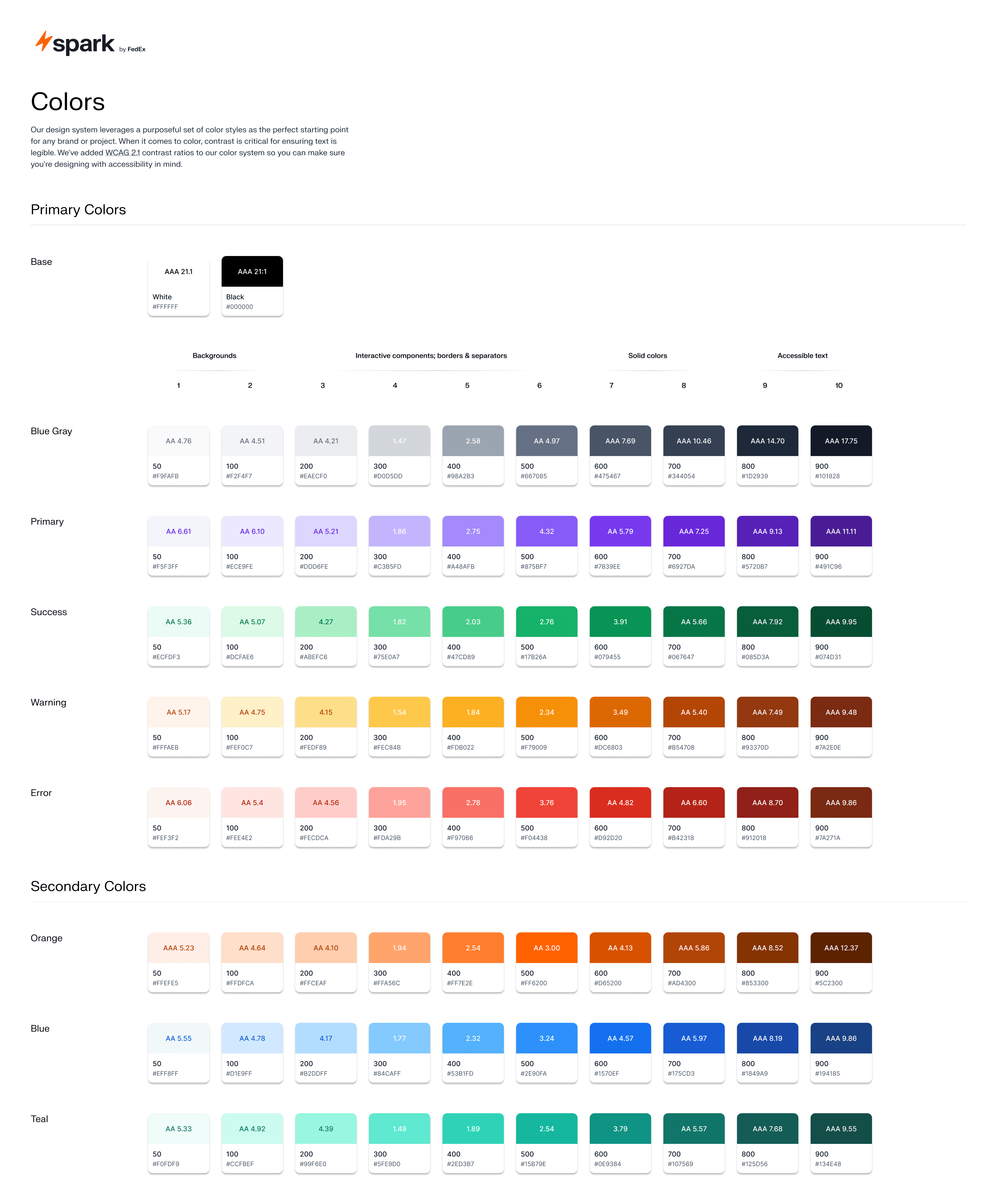
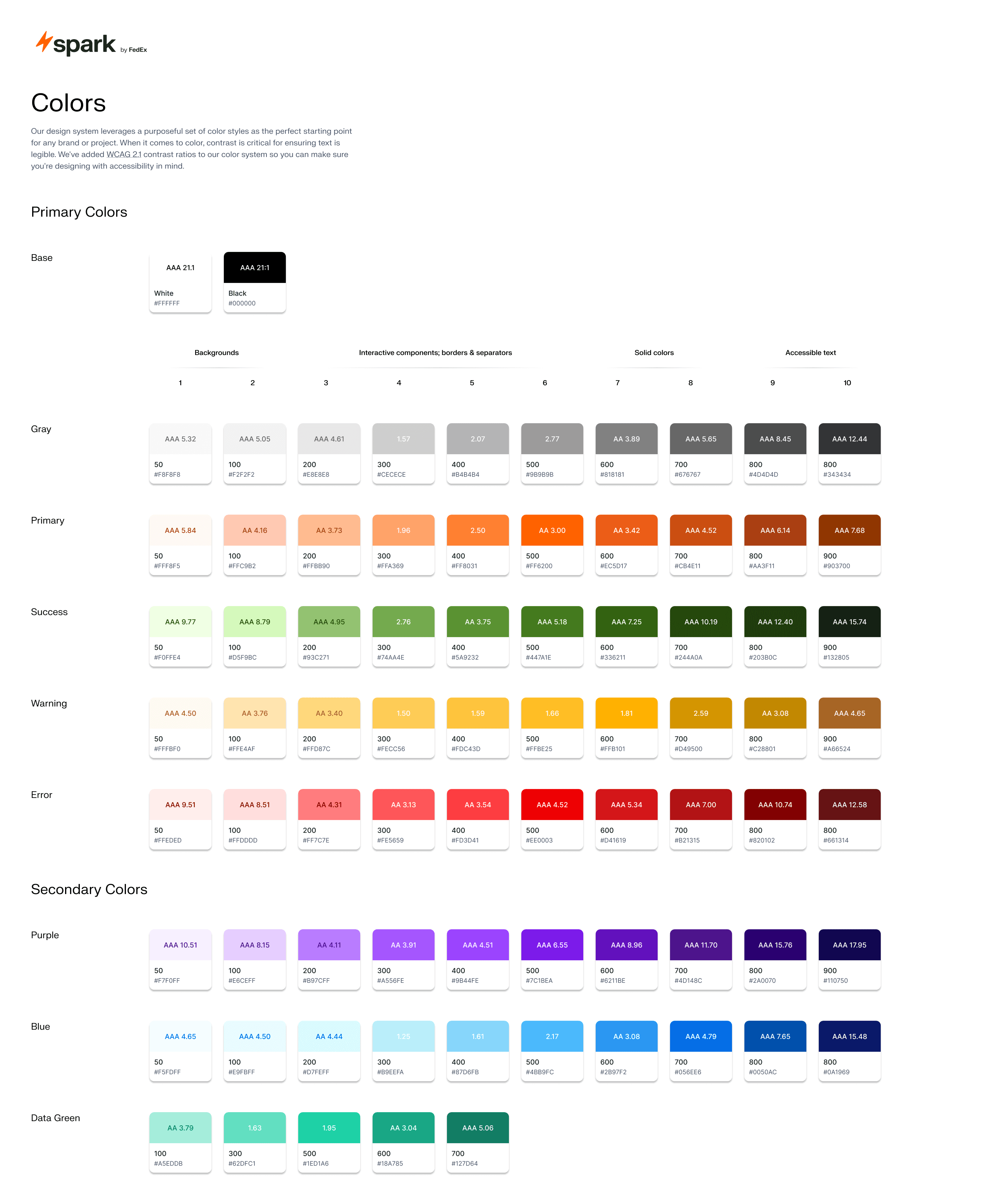
This design system included a brand identity that influenced our design principles (what is our purpose) and voice & tone (what we say and how we say it).
It also included more granular details on our color palette, typography scale, iconography, and more. A huge win came when I revamped our color palette using LCH (Light, Chroma, Hue) color space principles. This allows for each color palette to scale seamlessly and accessibly.
After
Before
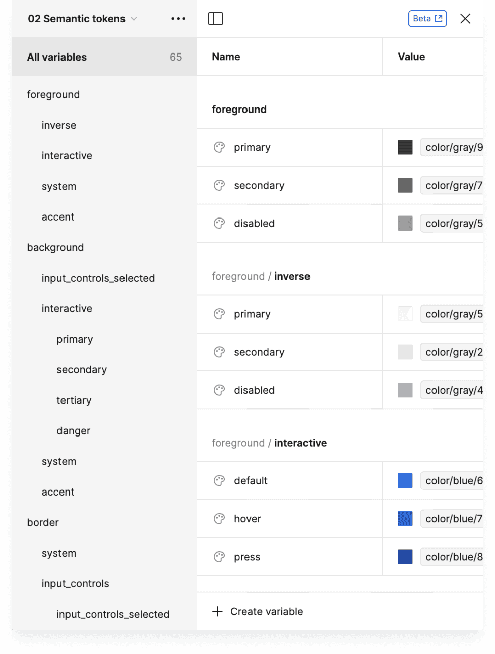
Adding structure with design tokens
I came to a major understanding of how much our development team relies on clear designs to decide what to code from working on the design system.
I spent a lot of time talking with engineers to understand their workflows and terminology to create a common language between development and design.
That language became our design token library which serves as a "backend" for our UI Components. Design system designers are the gatekeepers of these tokens with core product designers providing feedback on their definitions.
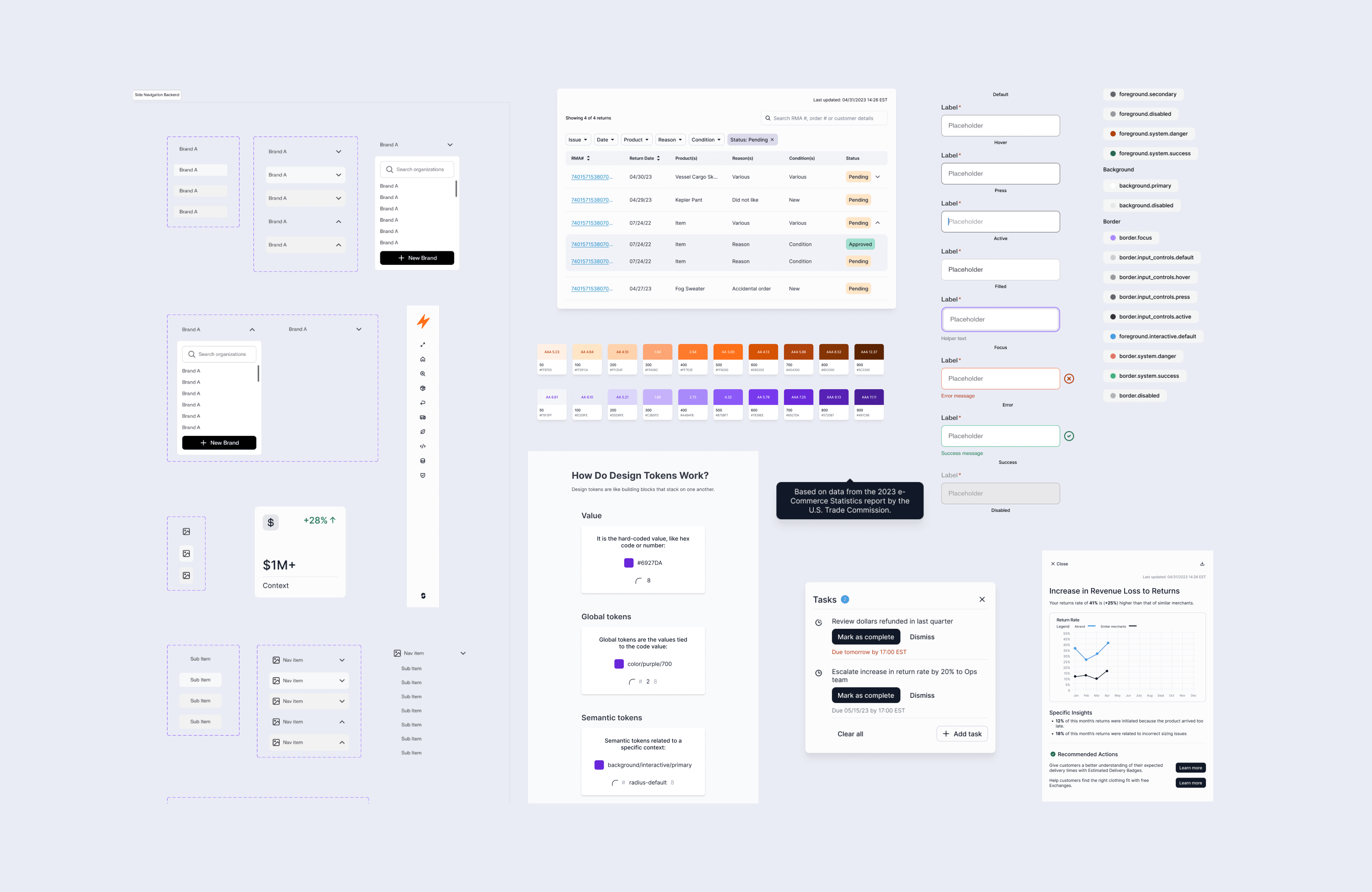
Rebuilding UI and refreshing visual design
Most Bolt components needed both a structural redesign and a visual design refresh.
Many were not originally built with auto-layouts or with proper responsiveness. Visually things looked sound but everything broke in use. The visual design was also in need of a modern update.
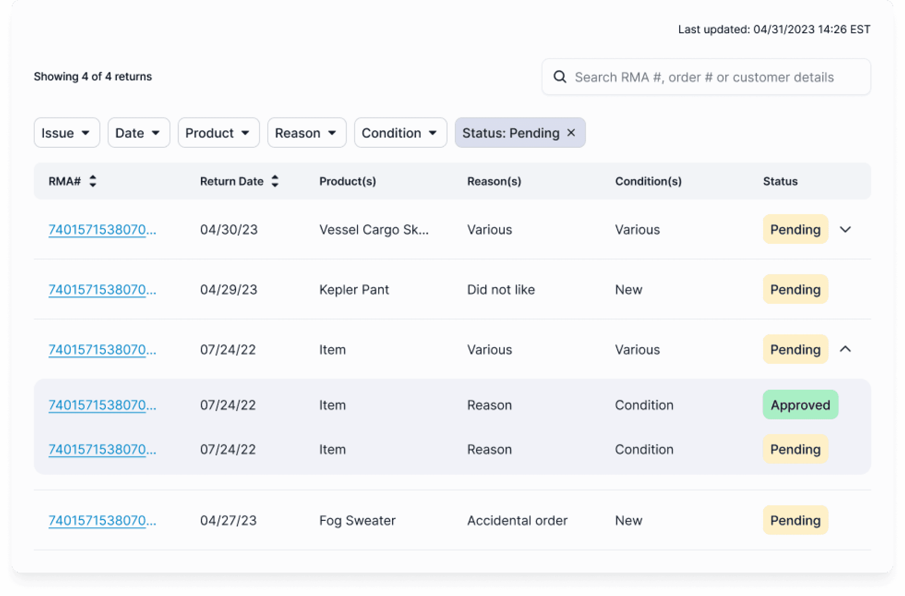
After
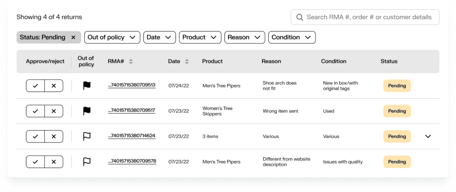
Before
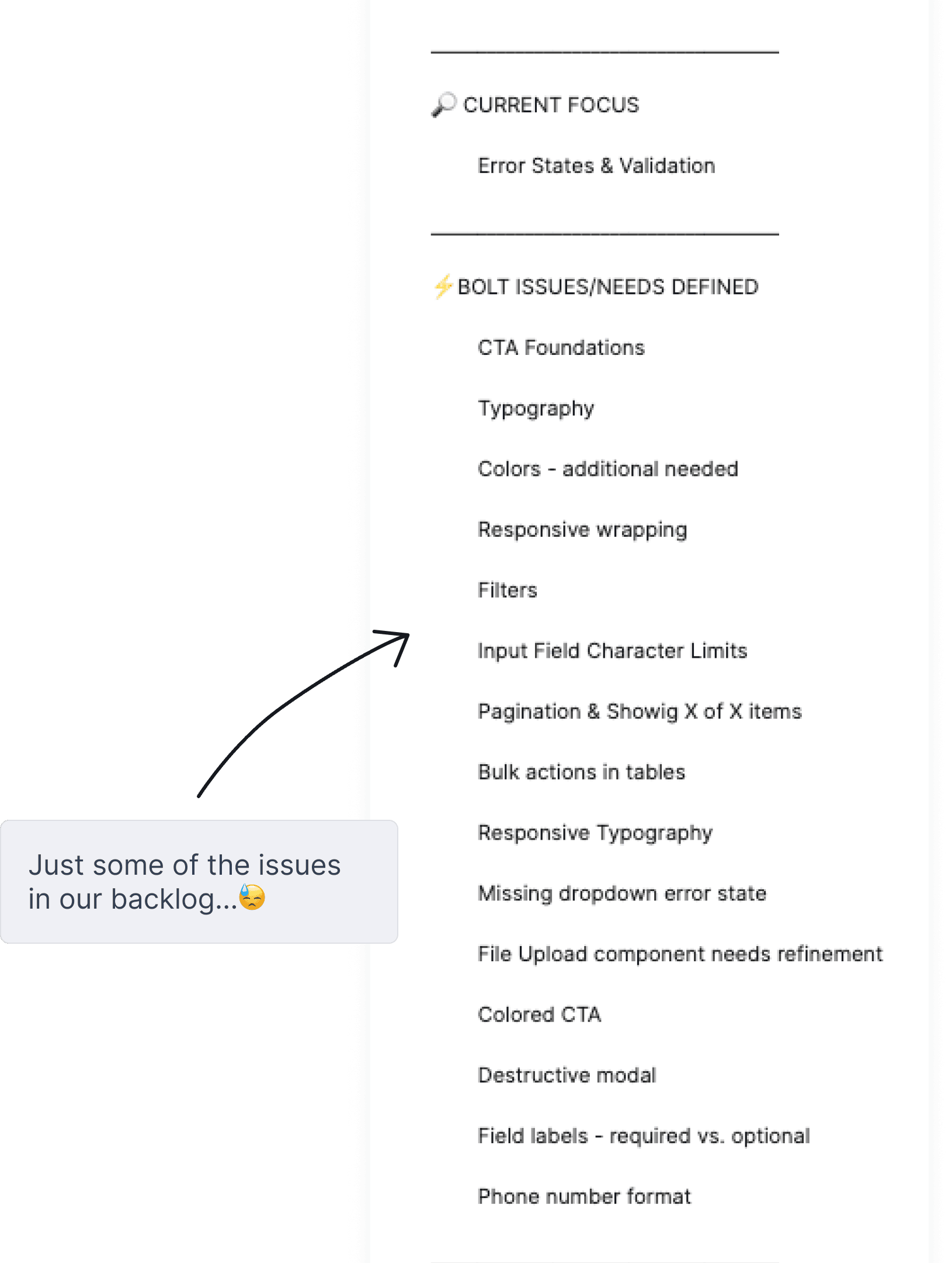
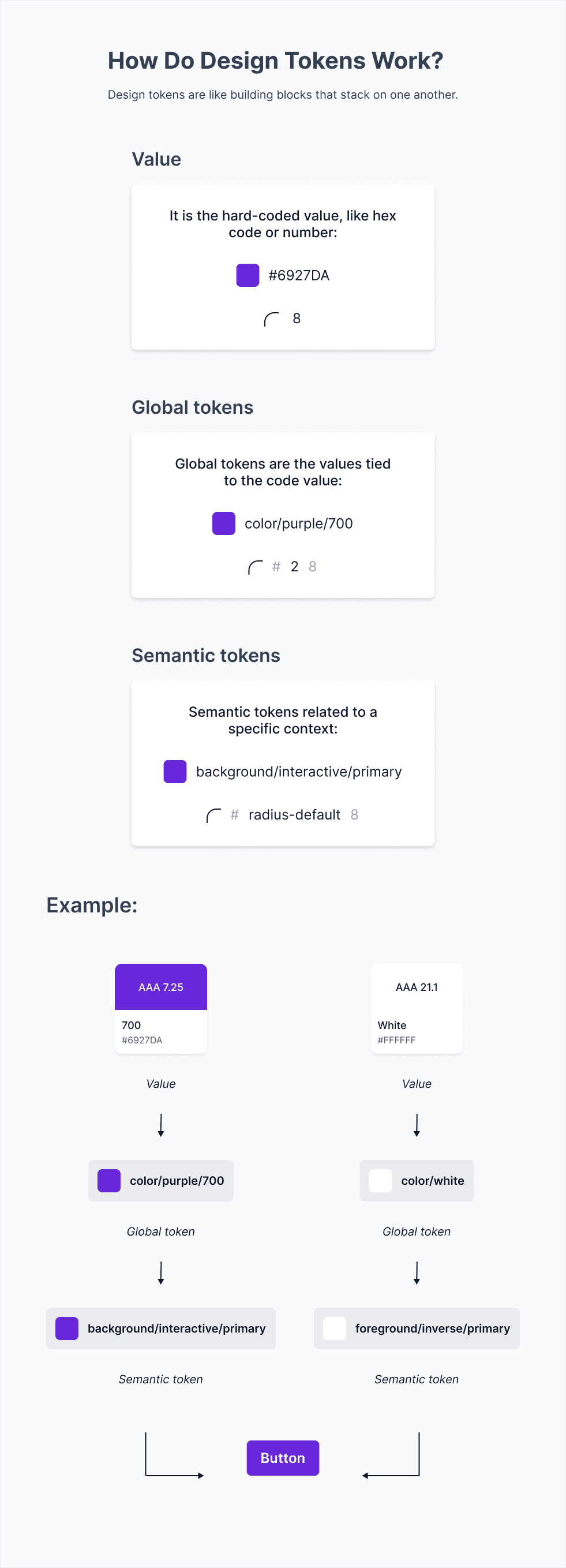
Documenting what's important
Design tokens were a new topic for me and my team at the beginning of this work. As I learned I wrote documentation to help educate the team on tokens and how to use them.
This infographic, for example, was quick to make but serves as a learning tool that can be revisited again and again.
Planning nice-to-haves 🪄
There are things missing from the design system that we haven’t built yet but are definitely future priorities.
Some of them are:
• Motion design—using open source assets like Lottie or tools like Jitter
• Sound design—using either open source or paid sound libraries
• Dark mode—using Figma Variables to easily manage colors, text, spacing and more across various components
Launched and actively in use
Design systems are by definition always in progress because they are living organisms. A new version of Bolt Design System was launched in May 2024 with the major foundations completed—typography, color, icons, shadows, spacing & sizing, and grids. This update marked a huge investment into the stability and future of the system. Since then much more progress has been made that is reflected in the fdx Commerce Platform.
I'm excited to continue contributing to this platform design system with plans to connect it to broader design systems used across FedEx products.